Navigating online experiences on your phone vs. a computer isn't always the most intuitive. (Ever tried to pay for something in a phone browser window instead of on a website? Painful.) Screens and keyboards are much smaller, menus are laid out differently, and platform requirements can make the look and feel of the same service vary from device to device.
In an effort to streamline how our customers get around our own mobile app, we are excited to announce a few changes that will make it easier to find—and use—the most important information you store in Dashlane.
Digital security depends on people actually using the tools that keep them safe. So if we see an opportunity to make Dashlane simpler and more intuitive to use, that's what we want to do!
What changed?
Save time: No more digging for key items
The way the iOS app was structured meant it required two taps to get to items in your Vault, like passwords, personal and payment info, Secure Notes, and IDs. Internally at Dashlane, we talked about how this was inefficient, and we heard from customers that you didn't care for it either!
Now, those key items are just a tap away thanks to the new horizontal menu sitting at the top of the main screen. One tap might be small, but saving taps saves time.
Old vs. new design
Introducing "quick actions"

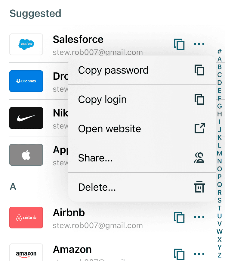
Speaking of saving time, we've also added something we call "quick actions" to your items. Tap the three dots on the righthand side of each item listed in your Vault to bring up a mini-menu that will allow you to copy different parts of your credentials or personal data, share or delete the item, or open the corresponding website. Like we said—saving you taps!
Stay in the know: Notifications are now front and center (well, front and left)
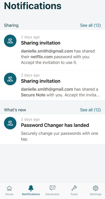
It should be obvious when something about your digital security needs your attention. That's why we've moved the notifications to the bottom menu of the app, right next to the home button. Now, you won't miss security alerts, sharing invites, or product updates.

Better UI: A more seamless look and feel
In addition to the menu changes, the new app is cleaner, less cluttered, and picks up on cues from Apple to feel more like a native app. This makes for a less jarring and smoother experience.
Moving forward, we'll be keeping our focus on useability and delight!
Sign up to receive news and updates about Dashlane

